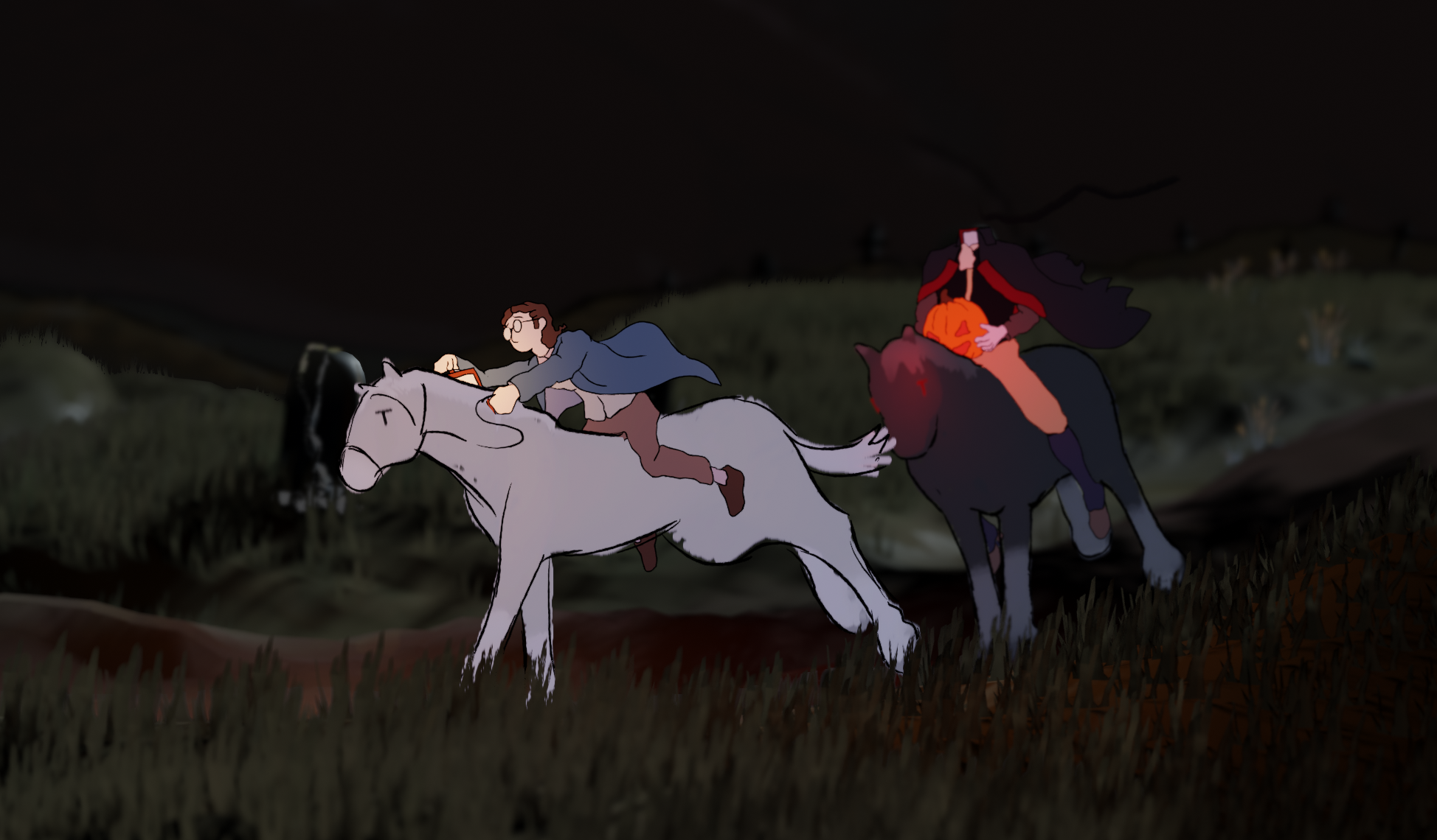
A Canter in Twilight
A story about a pleasant evening horse ride menaced by the ghost of a dead Hessian.
The project explores hybrid animation, blending drawn and 3D elements to present an intense mood and atmosphere while depicting a compelling narrative. I chose The Legend of Sleepy Hollow as a reference to early Disney features, where instead of writing their own material, they adapted fairytales and folklore while developing and perfecting their medium. In the same way, I was interested in exploring a new hybrid style of animation, so I chose the already existing story of Ichabod and the Headless Horseman to work with while I experimented with imagery and different techniques.

Hybrid animation has been around since the invention of the medium. While researching its many implementations I became interested in hybrid 3D/2D animation. This was also inspired by the modern resurgence of hybrid styles in feature film and television animation. I found that a lot of modern uses incorporate hand-drawn elements into what is primarily a 3D work. Although that makes for really beautiful and exciting art, I decided to explore a less popular implementation, with more traditional animation acting as the primary subject within a 3D setting.
Although I am by no means a great traditional animator or draftsman, I decided to face the challenge for the sake of exploring what sorts of visuals are possible when working outside of industry standards or popular techniques.
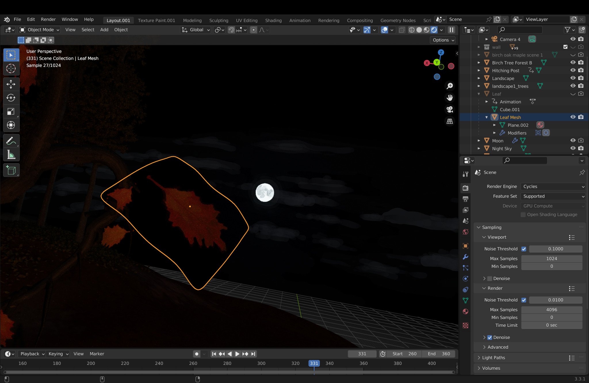
For this, I decided to work in Blender. After some tests with other programs and methods, I found that Blender’s Grease Pencil tool was the best option for my makeshift pipeline. The tool is somewhat new and lacks the complexity of other traditional animation software, but its integration into the Blender’s 3D workflow was enough to overlook Grease Pencil’s many flaws.


Backgrounds
For the sets, I was interested in using 3D for the foreground and midground, and matte paintings for the background elements. I also found that using drawn elements within the 3D scene (vines, shrubs, leaves, etc.) helped make the scenes feel more lush and lived in, something that can be challenging when working with exclusively 3D elements.
My process for the matte paintings was heavily inspired by Nick Cross’ method on Over the Garden Wall. In a similar manner to his work, I first created a base linework that highlights drawing techniques like hatching and contours. Then for the color, I painted in a series of layers, trying to emulate classical painting techniques like glazing and underpainting. This was made very challenging due to the Grease Pencil’s limited toolset in Blender 3.4, but with the use of custom brush images, varied levels of opacity, and the few available layer blend modes, I produced very moody and cohesive paintings that helped define the atmosphere of each scene.


When implementing the matte paintings, I took advantage of the 3D software to create parallax and depth by scaling and distancing the drawings. This emulates the Multiplane Camera pioneered by Disney, which not only acts as a meta nod to the history of animation but functions as a highly effective hybrid method for representing wide-open landscapes.
Blender’s Grease Pencil objects are not rendered in the same pass as geometry. This results in a few problems with lighting and alpha textures that I will discuss later, but here the relevant problem is that depth of field from the camera does not affect the Grease Pencil objects. This results in a sufficiently blurry and realistic depiction of space within the 3D scene, with the Grease Pencil objects then added on top with no camera effects. This really threw off the multiplane effect I was going for. Luckily though there are two solutions I was able to employ.
The first is by making use of the depth pass in the compositer. Although not affected by the camera’s settings, the Grease Pencil’s origin is recorded in the depth pass, so instead of using the in-camera depth of field, it’s possible to apply it with the depth pass in the compositer and get it to include the Grease Pencil objects.
The second method is by using the blur effect, which can be set to emulate the Depth of Field. Although I ended up using this method more often to properly blur the out-of-focus Grease Pencil objects, I found that the depth pass produced a much better look, so I would recommend the first method if time allows it.


Speedtree
I realized early on that making trees is crucial to making a good forest. I really did not want to use anyone’s premade assets, and at the time I did not have any go-to methods for making trees, so I chose to learn Speedtree. After a week or so I was able to confidently handle the basics enough to populate my forest.
To further emphasize my hybrid intentions, I chose to generate the tree shapes with decently realistic standards. Tall thin birch trees, wide-reaching maples, and this above decrepit red oak. However, for the bark and leaves, I digitally painted them. I found that this really helped emphasize the hybrid nature of these backgrounds and acted as a nice compliment to the layered matte paintings in that they are realistic 3D elements that retain the charm and aesthetics of hand-painted backgrounds, an inverse of the multiplane trickery implemented in the background.
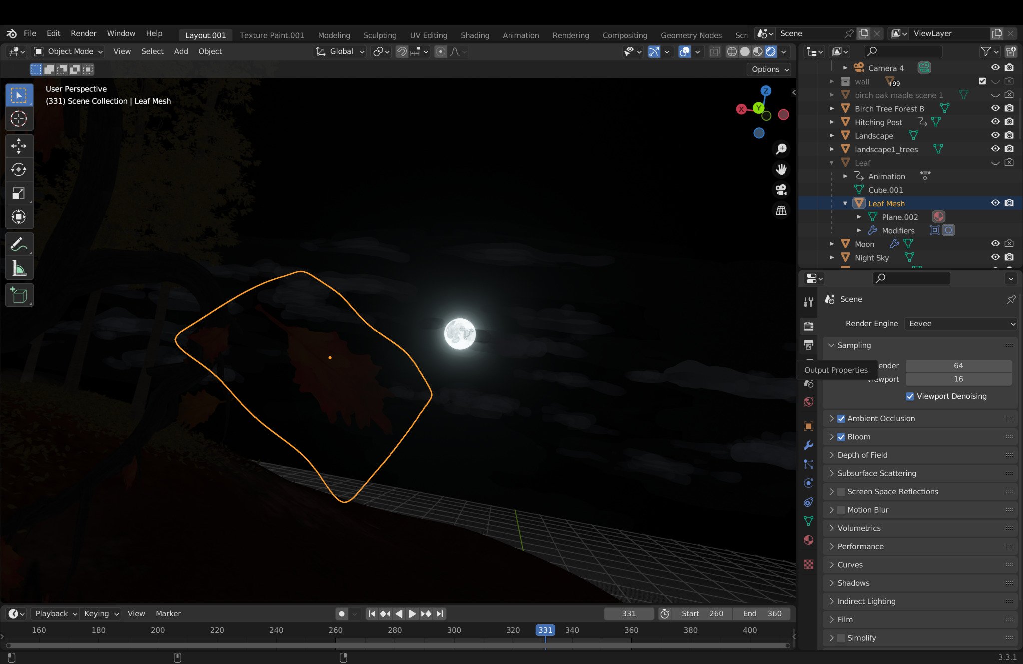
An issue that arose from this was with the use of alpha textures on the leaves, as shown above. My initial plan was to use Blender’s Cycles engine. I liked how the photo-real light worked with the hand-painted textures of the 3D elements. However, that quickly fell through as I discovered the render pass problem mentioned before meant that Grease Pencil objects could not be seen through alpha textures. Luckily the Eevee render engine was able to solve this issue (I’m not sure why), but because of the prominence of alpha-textured leaves, both on the trees and as decoration for the earth, my hands were tied and I chose to switch over to Eevee rather then work out a new leaf method.
Horses (Grease Pencil Puppets)
Initially, the horses in the short are hand drawn, acting as animated planes within the 3D scene, the same as the characters. As I progressed, I realized the complex perspective changes the characters underwent in my animatic would require more time than I could afford. My first solution was to animate the horse sections with a rough 3D model and then trace the model afterward to keep it cohesive with the character animation; however, this project was far more an exploration in style than it was a polished piece of animation. So I decided to use this as another opportunity to explore hybrid techniques.
Grease Pencil objects contain vertices within their strokes that can be weighted and rigged. There was a few possible workflows that I was aware of at the time showing off rigged Grease Pencil puppets, allowing for puppet/cut-out style animation within Blender. I wanted a similar system but that allowed for changes in perspective beyond the initial plane of the drawing. Although there are systems possible where rigs can be created to completely switch the drawings, allowing for different perspectives to be built into one rig, due to my many bespoke camera angles, its efficiency was not all that beneficial considering how many drawings it would require.
In the end, I chose to create a 3D model from Grease Pencil strokes and use the vertex weight to be driven by a 3D rig. This method was inspired by Sophie Jantak’s method; however, I used vertex weight painting instead of a mesh of lattices, which allowed the rig to deform the mesh with more control and far less deformation, which was much better for animating.
The lighting turned out to be my favorite part of this method. Blender does not light Grease Pencil objects the same way it lights geometry or volume data. Instead, it uses light direction and proximity to determine each vertex’s color value based on the viewport display color (used to determine the darkest possible value) and the color of the light (used to determine the brightest possible value). This results in smooth gradients between dark and light areas of the object, removing any hard shifts between areas cast in light and shadow.
The major stylistic downsides to this system were that outlining the horses was not possible through any conventional method (inverted hull, Freestyle, etc.), and that Grease Pencil objects do not cast shadows.
The outline problem was solved painstakingly by drawing outlines into each frame in the same plane as the character animation. I felt outlining the horses was necessary to keep a feeling of cohesion in the character animation, even though it would be apparent to the viewer the horses were not drawn by hand.
For the shadows, although the horses are shown to be lit, with certain areas brighter and darker than others depending on the lighting, they do not cast shadows onto the geometry below them. This comes from the Grease Pencil being added in a pass after the lighting for the geometry is generated (same as the depth of field issue earlier). So for the horses to cast a shadow it must be drawn by hand, which I ended up omitting for time. Luckily it’s a very dark setting, which helps cover for the fact the horses and people have no shadows.
The only major technical errors were the deformations and some strange lighting artifacts. Deforming the horse with the rig was the best I had seen done anywhere at the time for what I was doing, however, it still resulted in many strange breaks and errors when the horse’s pose was pushed too hard. I was able to fix most of them by further sculpting the strokes, increasing the blur, or drawing in added layers with the outline to hide the issues, but the only way I could think to solve this completely would be to use a different pattern of strokes when building the horse, which I was unable to make time for during the project.
The lighting artifacts I am referring to can be seen in the demo video above when the camera moves past certain views, resulting in the horse becoming dark for a short moment. This was easily remedied by playing with the location of the point lights in my scenes, and often animating them as the scene played out in order to avoid any problematic setups. It doesn’t seem to have any apparent complete solution, but with just a little more care to be put into the lighting, it can be easily dealt with.

Overall I found this method to be a really useful compromise between 3D and 2D that allowed for some of the convenience found in 3D objects and some of the aesthetic of drawing. Although I might not replicate this method entirely in the future I will continue to explore and improve it in future projects.

Installation and Sound

I installed the project at Mana Contemporary for one week from March 20th to March 27th. My original plan was to use a projector and speakers. I decided against this as I found the TV retained the low-light colors much better than a projector in the exhibition space, and the headphones provided a more intimate and focused viewing experience.
For the sounds, I relied heavily on foley found online, with a few recordings of my own added in. It is easily the weakest point of the short in my eyes; however, the addition of the clopping hooves, whistling wind, distant animal calls, etc. significantly improved the animation’s believability and the attention spans of my audience.
I first planned to create my own soundtrack after I had finished the rough draft of the short (thinking of John Carpenter’s method for scoring his films), but I was very dissatisfied with my efforts and instead decided to make use of Modest Mussorgsky’s A Night on Bald Mountain. I listened to the piece often while creating the storyboard/animatic and decided it would fit as a soundtrack. I cut the piece and applied it to the short to try and match the tempo of the animation, as it was not made with any particular piece of music in mind. Although not perfect, I think the excitement and darkness of the music and its cultural connection with Disney’s Fantasia really improved the tone of the short.
Storyboards and Animatic
I was very concerned with the composition, transitions, and mood of the animatic. I knew I would be using 3D sets so I figured it would be best to work out the important elements of the compositions in the animatic so I wouldn’t flounder later on when deciding the camera positions. Besides with a few scenes that were added after the production started, this became a useful tool for setting up the camera and lighting in each scene.
I found being conscious of the horizontal balance of a scene made for the best compositions within the wide aspect ratio I chose. Unbalanced scenes, with wide dark passages flanking the action, helped increase tension, while balanced scenes helped focus the viewer and heighten the excitement. I also enjoyed exploring how the use of stark lighting set ups could help direct the eye and establish tone.
I also decided at this stage that there would be phases within the animation. I planned to have the work progress further towards expressive and loose motion, culminating in the explosive, completely hand-drawn, finale. I was also interested in dividing the work into three stages based on the tone of the narrative, starting slow and eerie, progressing to paranoid and surreal, and finally ending in fearful and exciting. For this I tried implementing different techniques for each stage, focusing on light and space for the first half, character acting for the second, and sweeping motion for the third.
Overall, I was able to narrow down my thoughts and solidify the mood and tone of the work in the animatic stage, although looking back I should have spent more time with the animatic to further narrow down the timing and narrative so that the production phase could be spent more efficiently.


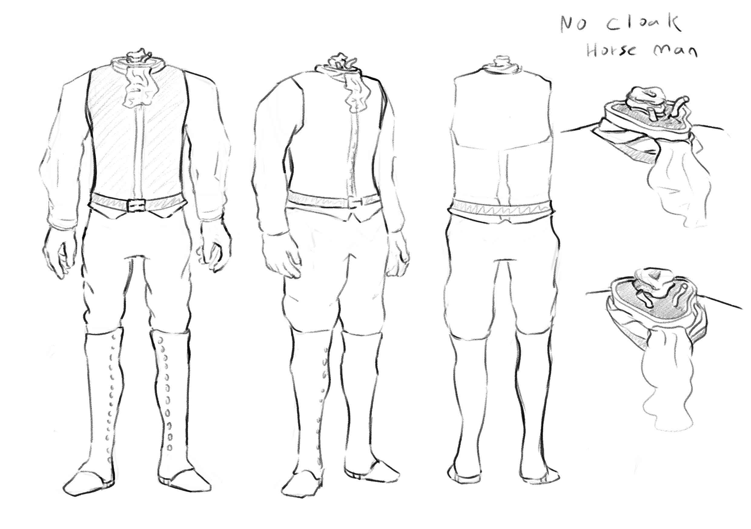
Designs

These are the final designs I settled on (without color, I worked that out in Blender where I was able to see the colors in the context of the 3D lighting). My goals in the design stage were to find compelling designs made of simple repeatable shapes. This was not entirely achieved. However, the looseness of things like the horseman’s cape and Ichabod’s jacket were helpful in capturing motion and interesting poses during the more intense sections of the short.
I initially struggled with forcing Ichabod’s face into expression, trying to decide whether his glasses should deform or not if his eyes should ever be visible, what hats and hair he should have, his mouth shape and jaw motion, etc. However, I was keen to make sure that my decisions were upheld throughout the short. This along with other small details helped strengthen the cohesion of the short, especially as the overall style shifts throughout it.

Process Blog
For further description of my process I invite you to look over my process blog. This is a record of the preproduction up to the early production of my project. Its somewhat informal and inconsistent but it helps illuminate some of my inspiration and research, a long with the early trial and error involved with creating the style and look of the short.